Personal branding for my small pottery business
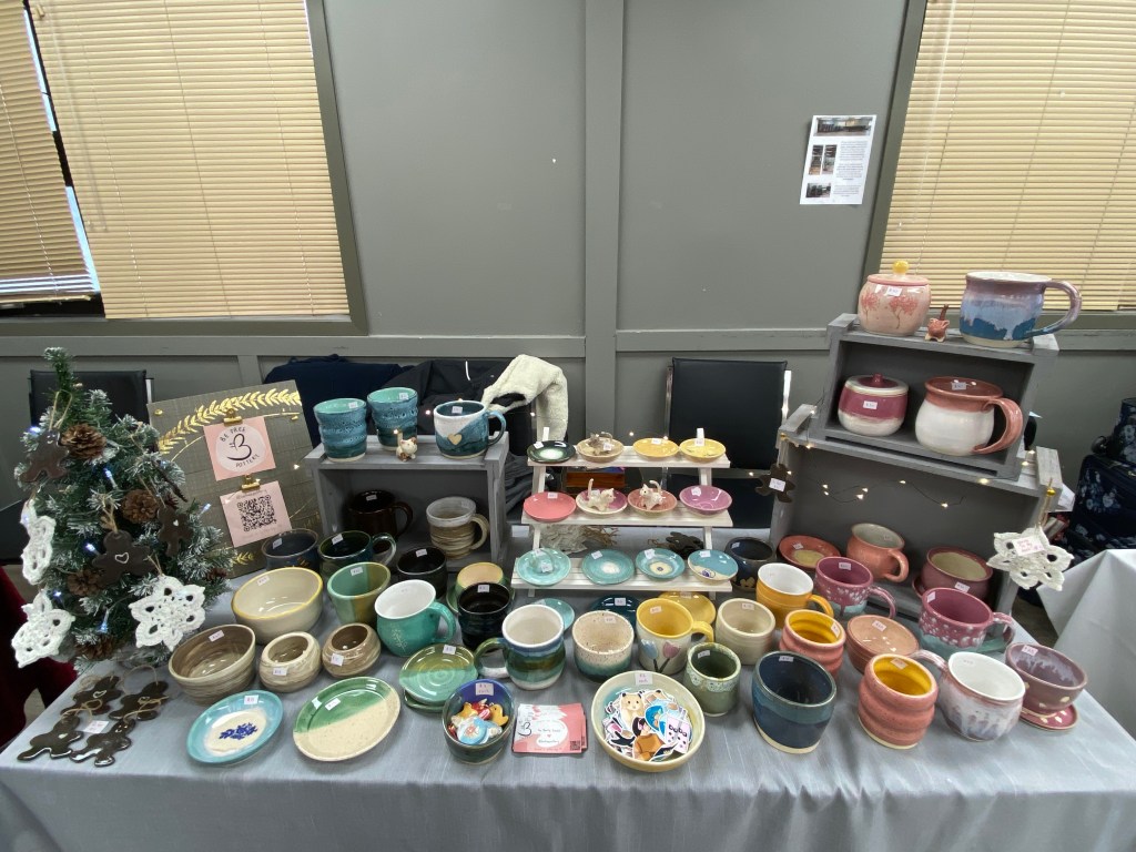
One of my more recent artistic endeavours has been exploring pottery. I did a small craft sale this past November, so I developed branding assets for my business.
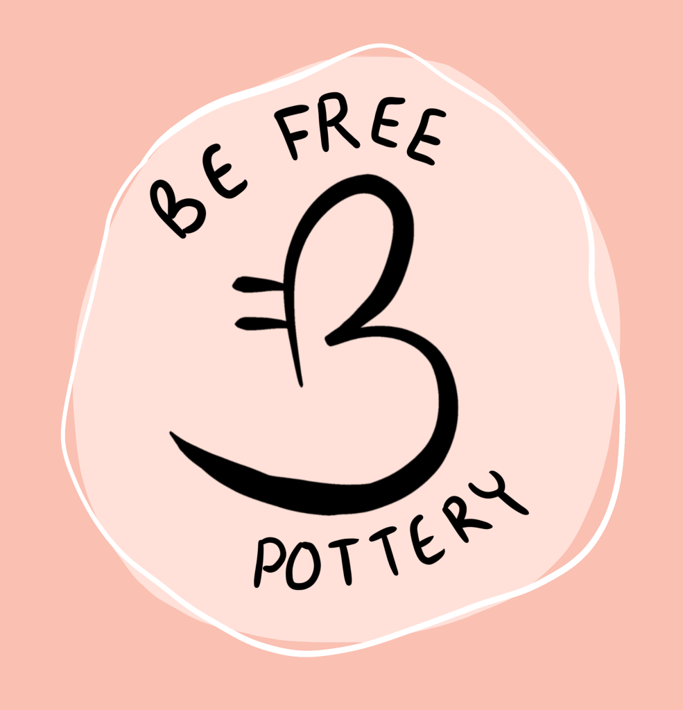
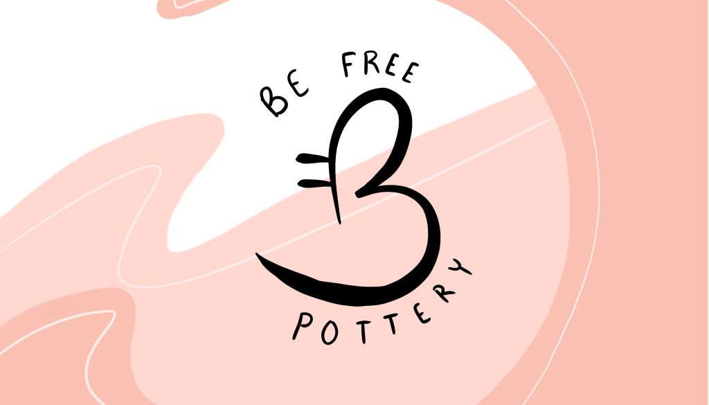
Logo Design: I used my initials B and F together to make a unique shape that also resembles a butterfly, symbolizing freedom and beauty for my brand. My pottery is colourful and unique, and I wanted the logo to acknowledge that. The inclusion of the tagline “be free pottery” came about organically, again utilizing my initials, a catchy rhyme, and summary of what my work is about.
The hand written text felt important to give it a more organic feel, while the pink colours spoke to the brightness of the work.

Business Card: The business card layout was a challenge to fit all the information I wanted onto just a front design, as there were barriers to printing a double sided design. I kept the typography hand drawn to create a more personal feel, something that I thought would be appreciated by the customers I’m marketing to. Including the QR code was an important asset to me, as I often found myself drawn to scan the QR codes of vendors at craft sales, making it much easier to find on social media.

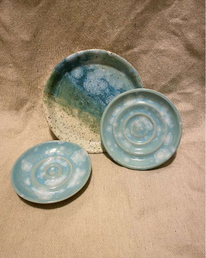
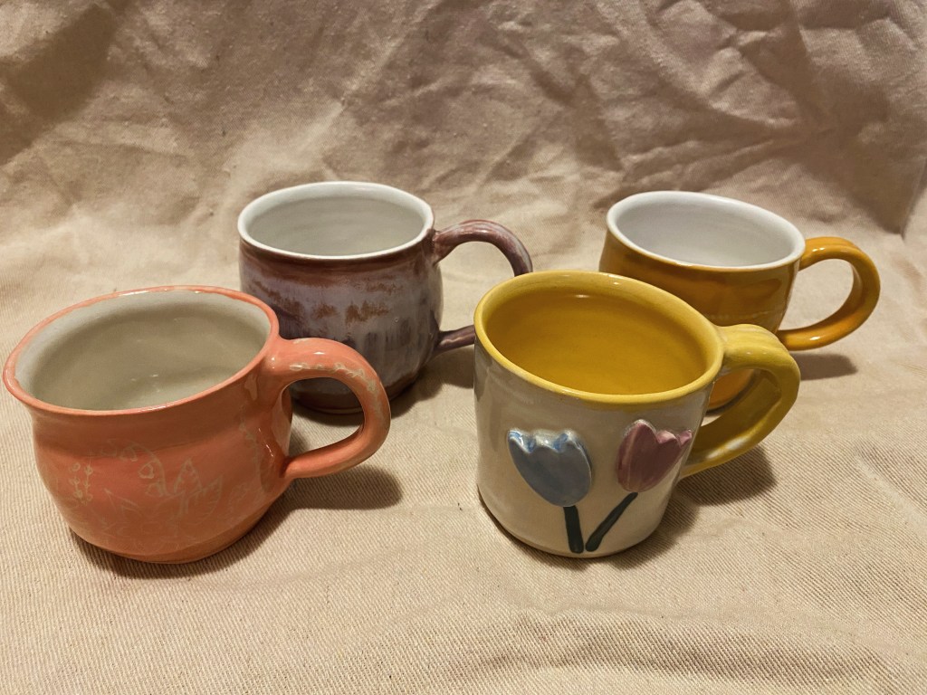
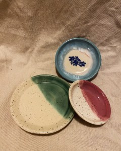
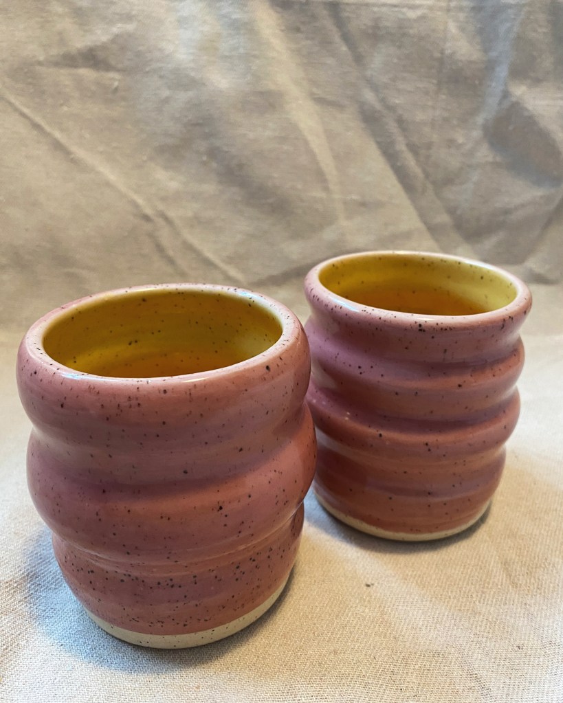
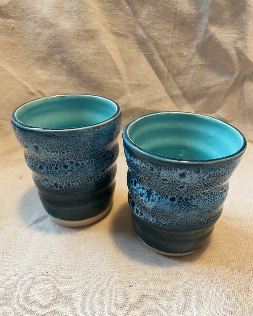
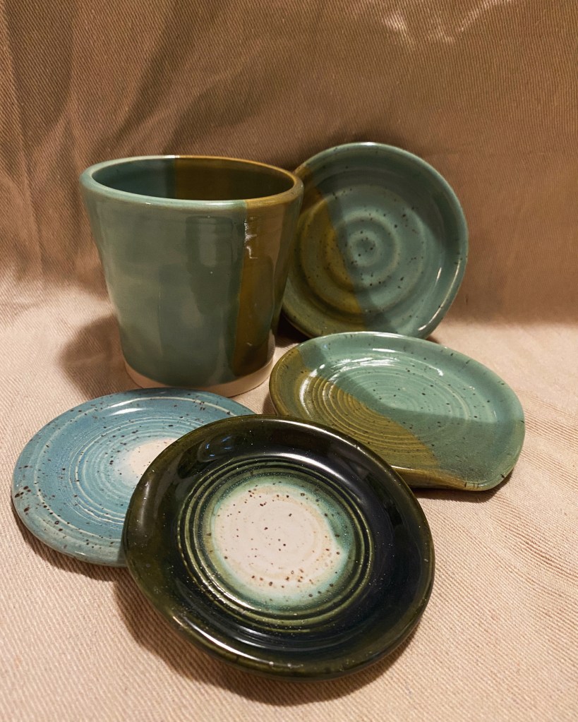
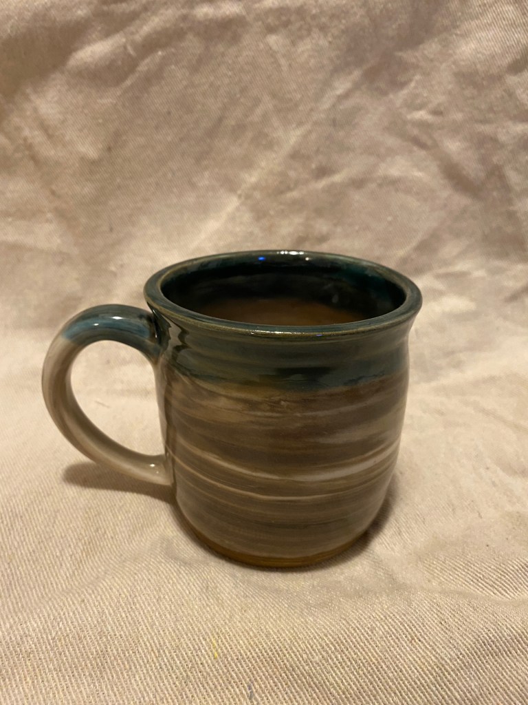
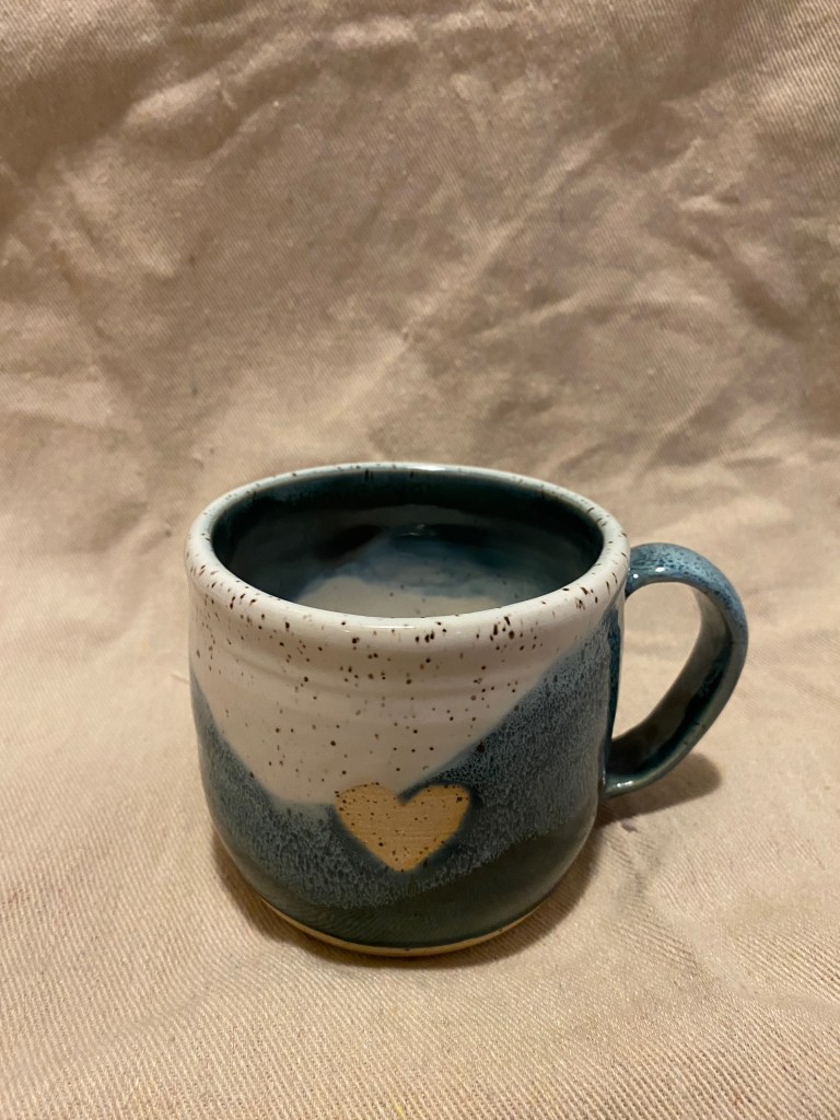
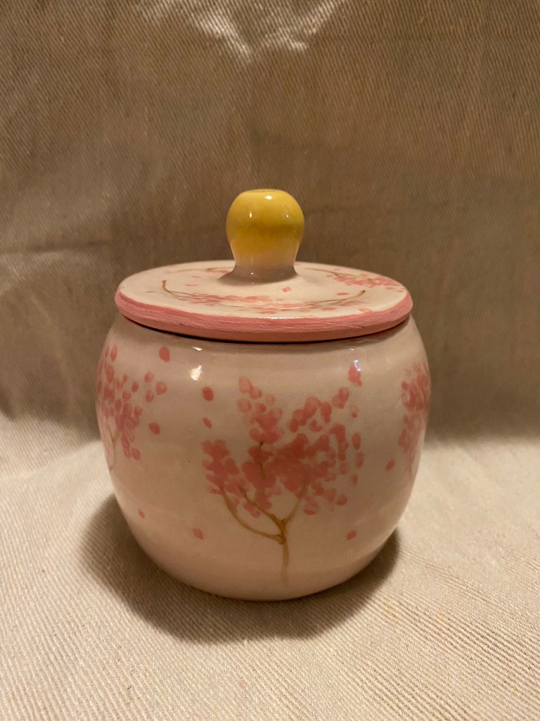
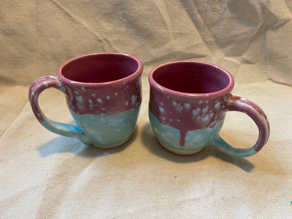
Pottery Photography